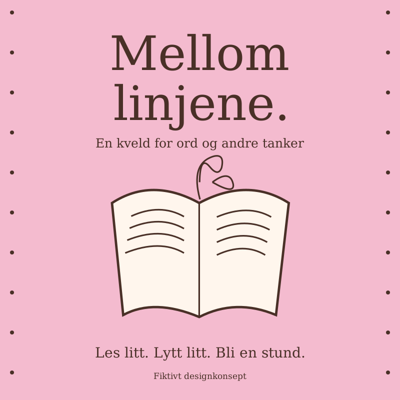
Between the lines
A fictional visual identity for a small literary event. A poster, colours and visual style adapted for both paper and screen.
Words need a visual voice too.
The concept gives a small literary event a friendly face. Pink surfaces, brown lettering and a drawn book come together in a simple, recognisable identity.
- Project type
- Self-initiated, fictional design concept
- My role
- Idea, visual identity and graphic design
- Audience
- Curious readers and students
- Deliverables
- Poster and social media graphics
A few notes on the process
An approachable look
A book is the starting point for the concept. I wanted to draw it in a way that feels open and a little imperfect.
A small, clear toolkit
Two main colours, one book illustration and a short title make the identity easy to recognise at different sizes.
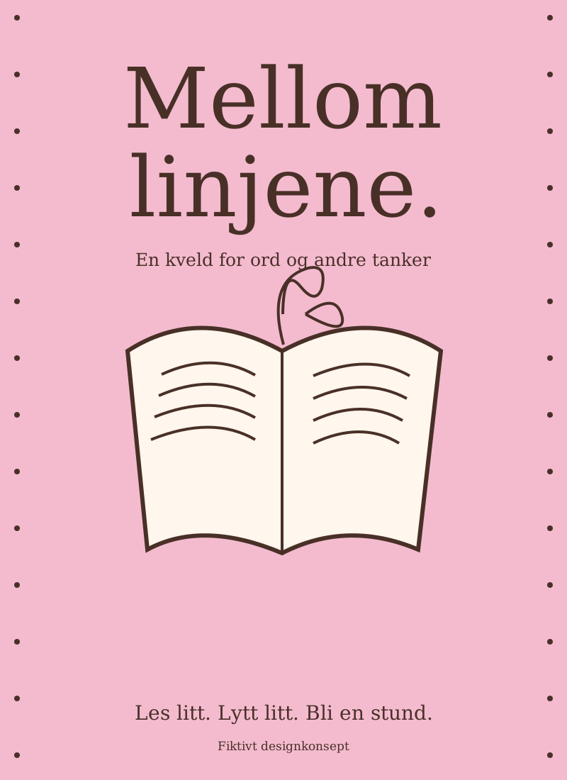
From poster to small screen
In the mobile format, the title gets more space. The small details move to the next image, keeping the message easy to read.
From print to small screen